2. Clean, describe, and visualize data
Learning goals
You will learn to:
- inspect missing values;
- select, filter, recode, and summarize variables;
- calculate descriptive statistics;
- compare groups;
- create a histogram and a boxplot.
Research question: What does the employee survey tell us about performance, satisfaction, and differences between the training groups?
Import and clean names
The pipe |> sends the result of one step into the next step. It can be read as “then”.
Check missing values
# A tibble: 1 × 2
  missing_performance missing_satisfaction
                <int>                <int>
1                   8                    8
NA means a value is missing. Missing data should be examined rather than silently ignored.
Select variables
employees |>
  select(
    employee_id,
    department,
    training_group,
    performance
  )
# A tibble: 480 × 4
employee_id department training_group performance
<chr> <chr> <chr> <dbl>
1 E000001 Operations Training 45.1
2 E000002 Operations Training 43.8
3 E000003 Operations Control 52.2
4 E000004 Technology Training 60.3
5 E000005 Operations Control 59.9
6 E000006 Technology Control NA
7 E000007 Finance Training 64.3
8 E000008 Technology Training 48.1
9 E000009 Operations Training 66
10 E000010 Operations Control 50
# ℹ 470 more rowsFilter rows
employees |>
  filter(department == "Marketing")
# A tibble: 100 × 26
employee_id age gender department remote_days tenure_years manager
<chr> <dbl> <chr> <chr> <dbl> <dbl> <chr>
1 E000013 37 Woman Marketing 4 3.6 Yes
2 E000015 46 Woman Marketing 2 1.3 No
3 E000017 54 Man Marketing 3 4.2 No
4 E000022 44 Man Marketing 3 4.2 No
5 E000023 43 Woman Marketing 3 9.1 No
6 E000025 36 Woman Marketing 0 1.8 Yes
7 E000039 23 Man Marketing 5 2.3 Yes
8 E000041 45 Non-binary / p… Marketing 2 6.9 No
9 E000043 39 Woman Marketing 0 4 No
10 E000050 46 Man Marketing 3 3.9 Yes
# ℹ 90 more rows
# ℹ 19 more variables: training_group <chr>, leadership_1 <dbl>,
# leadership_2 <dbl>, leadership_3 <dbl>, leadership_4_reverse <dbl>,
# engagement_1 <dbl>, engagement_2 <dbl>, engagement_3 <dbl>,
# engagement_4_reverse <dbl>, role_clarity_1 <dbl>, role_clarity_2 <dbl>,
# role_clarity_3 <dbl>, role_clarity_4 <dbl>, workload <dbl>,
# organizational_support <dbl>, job_satisfaction <dbl>, performance <dbl>, …Use == to ask whether two values are equal. A single = is normally used to name a function argument.
Create categories
mutate() creates or changes variables. case_when() is useful when a new category depends on several rules.
Count categories
employees_clean |>
  count(department, sort = TRUE)
# A tibble: 5 × 2
department n
<chr> <int>
1 Operations 125
2 Technology 104
3 Marketing 100
4 Finance 97
5 HR 54Calculate descriptive statistics
# A tibble: 1 × 5
      n mean_performance sd_performance median_performance mean_satisfaction
  <int>            <dbl>          <dbl>              <dbl>             <dbl>
1 480 53.9 9.17 54.2 3.98- The mean is the arithmetic average.
- The median is the middle value.
- The standard deviation describes spread around the mean.
na.rm = TRUE tells the function to remove missing values for that calculation.
Compare groups
# A tibble: 2 × 4
  training_group     n mean_performance sd_performance
  <chr>          <int>            <dbl>          <dbl>
1 Control          224             52.0           8.78
2 Training         256             55.6           9.18
group_by() changes the level at which a later summary is calculated.
Visualize a distribution
ggplot(employees_clean, aes(x = performance)) +
  geom_histogram(binwidth = 5, boundary = 0) +
  labs(
    title = "Distribution of employee performance",
    x = "Performance score",
    y = "Number of employees"
  )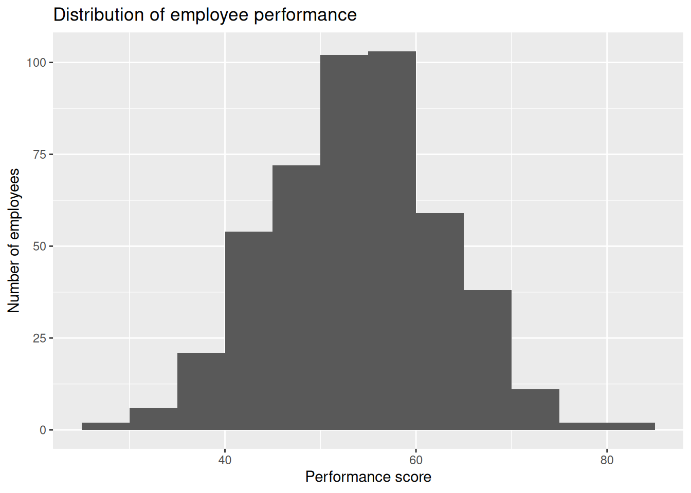
A histogram shows the shape, centre, and spread of a numeric variable.
Compare distributions across groups
ggplot(
  employees_clean,
  aes(x = training_group, y = performance)
) +
  geom_boxplot() +
  labs(
    title = "Performance by training group",
    x = NULL,
    y = "Performance score"
  )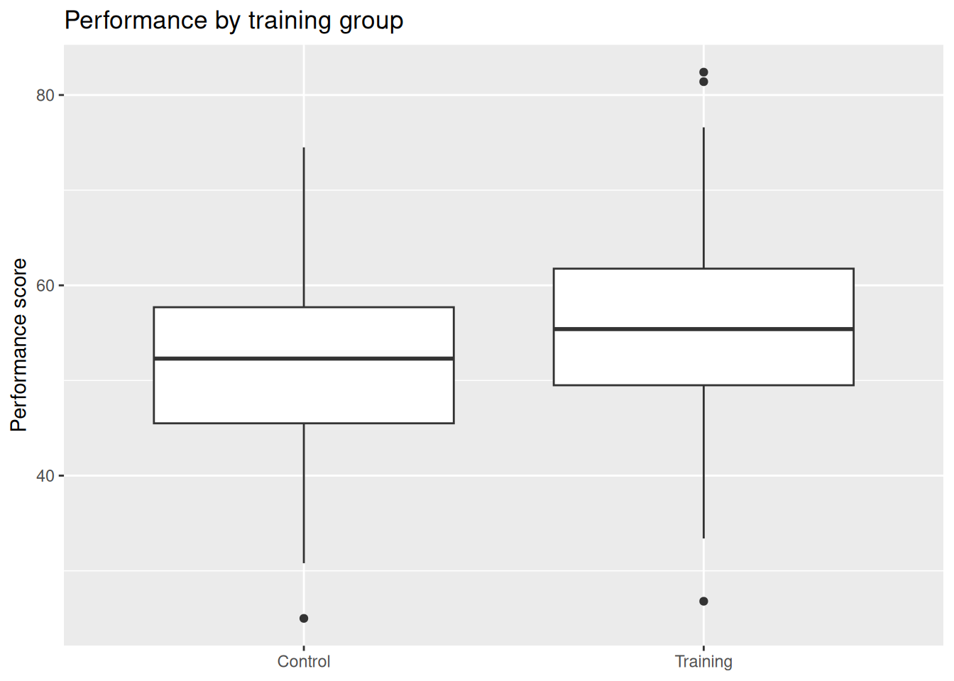
A boxplot helps compare medians, spread, and unusual observations.
A visible difference in a graph is descriptive evidence. It does not by itself show whether the difference is statistically distinguishable from random variation, nor whether training caused the difference.
Practice
- Calculate mean burnout by department.
- Count employees in each
remote_mode. - Draw a histogram of
job_satisfaction. - Draw a boxplot of burnout by
remote_mode.
Common mistakes
- Forgetting
na.rm = TRUEwhen missing values are present. - Treating a coded category as if it were a continuous number.
- Reporting only a mean without also checking the distribution.
- Using a graph to make a causal claim.
Takeaway
Cleaning and descriptive analysis come before formal tests. They reveal data quality problems and help determine which method is appropriate.